Shelly's Nannies has matched families with nannies in Toronto and surrounding areas since 1998.
What began in a friend's basement, grew into over two decades of successfully matching families with nannies across the GTA. As times change, so does the need to stay current. This project focused on a full website redesign, branding refresh, and a new logo.
Like any website redesign, there will always be challenges along the way.
a) Modernizing the logo, while keeping it feeling familiar.
b) Mobile optimization.
c) Streamlining online forms for easier sign-ups.
d) Making navigation simple for both families & nannies, while ensuring all services, policies, and contact details are current (this must reflect the brand).

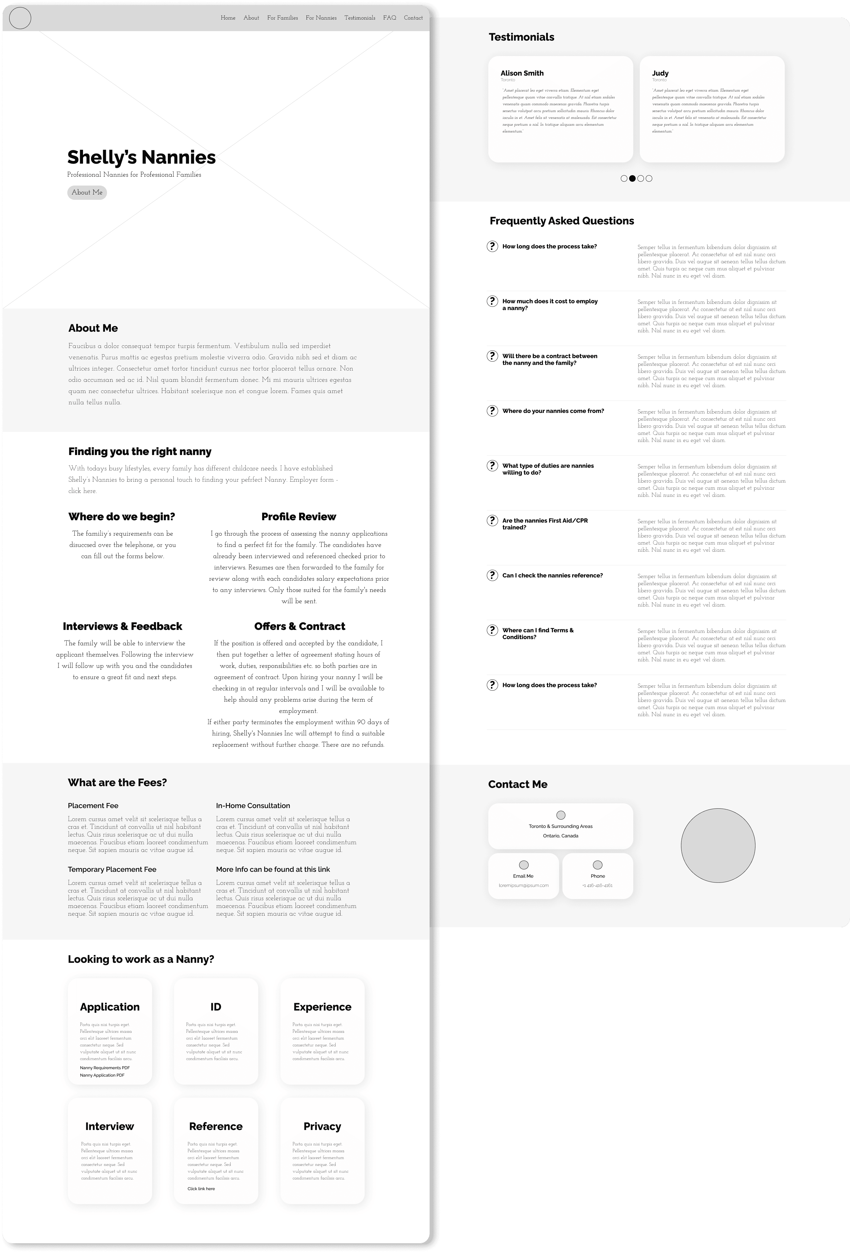
These wireframes were created to begin visually walking Shelly through these steps of the design process, incorporating all of the content that was present on the previous site. The page is clean, offers all pertinent information via easy to find links and welcomes users with its calm, welcoming vibe. We laid out everything onto one page, as the client felt that nothing more was needed.

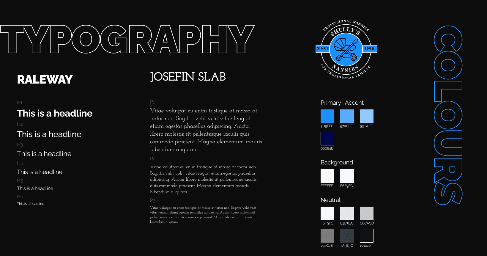
The previous website did not have a clear colour (brand) scheme or logo to compliment the business. Shelly stated that her favourite colour is blue, so we went back to the drawing board to create a style that is best suited for Shelly's Nannies.
This shade of blue was chosen as the primary and accent to evoke a sense of calm, trust, and confidence.
Raleway font was chosen because of its big bold look, perfect for headlines and big text.
The client had a font on her previous website that she wanted to use again, Josefin Slab.
The logo was created to brand all application forms, and with Shelly's Nannies stamp of approval, was used for the website and any advertising content online.

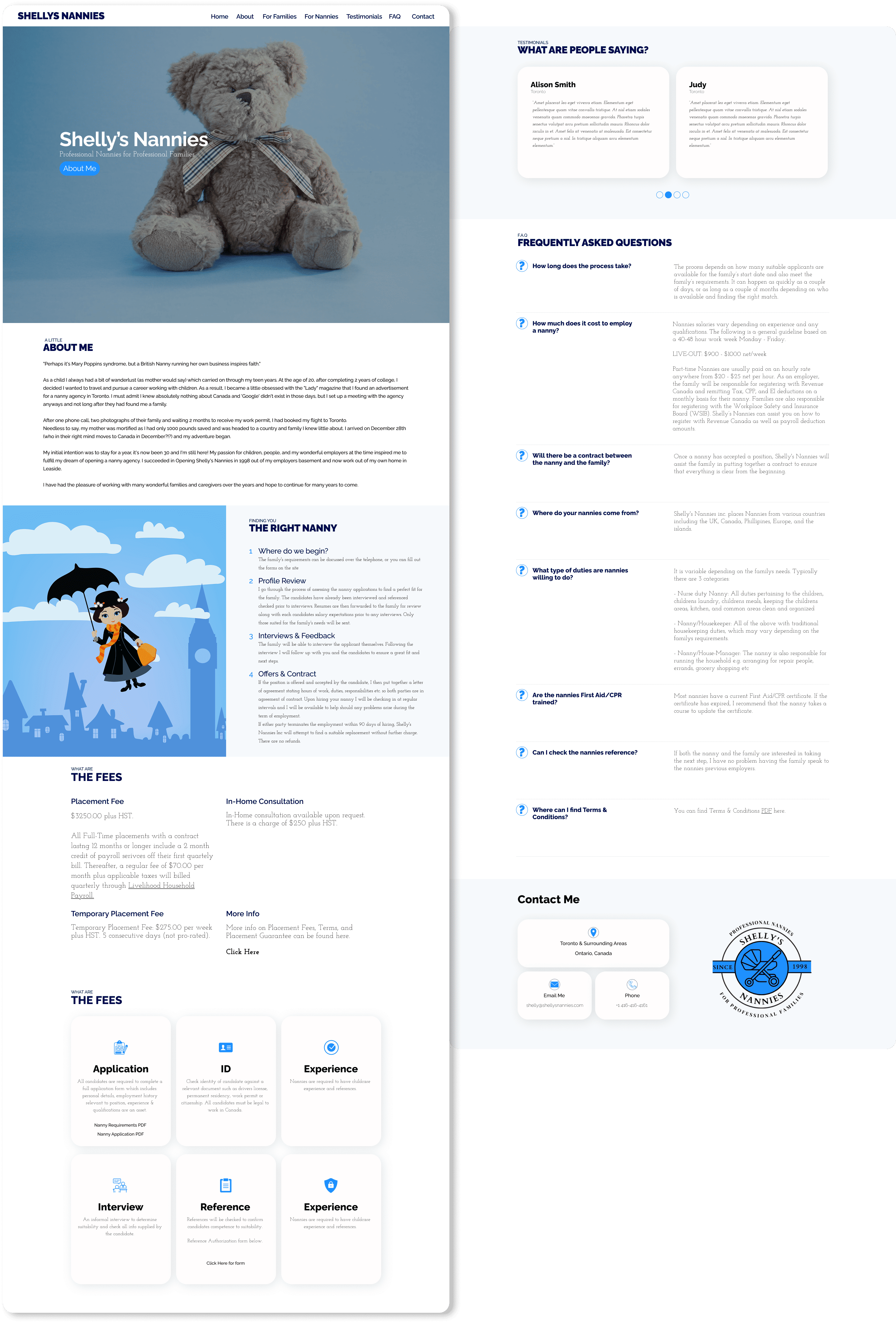
Shelly's Nannies was very happy with the new logo and website redesign. Keeping everything on one page helped keep loading times fast and ensure all PDF forms & information are easily accessible.
The Mary Poppins image was added during the final stages to bring more colour & personality into the page. The simple layout and blue accents help bring a warm, inviting, trustworthy vibe to the site.

Sketch
InVision
Github
VS Code
This project was a valuable learning experience. Looking back, I would refine a few details.
The logo works at larger sizes but loses readability when scaled down. A redesigned version should be bold, minimal, and recognizable without text. This could possibly incorporate Shelly's Nannies initials or a stroller icon.
The layout could also benefit from an additional image. The page seems a tad empty and this could create better visual balance and enhance engagement.