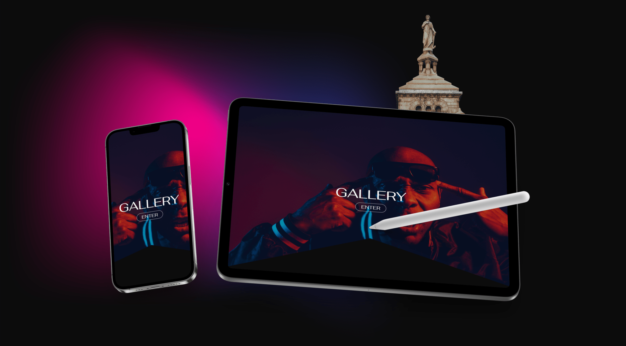
Origin Mind Photography, launched in December 2023, offers users an immersive gallery of global photography with the ability to purchase prints through an integrated eCommerce shop.
As the sole designer, my role encompassed UX research, user interviews, wireframing, and final implementation.
In today’s digital age, a strong online presence is essential for sharing creative work with a global audience, and photography is no exception.
This project focused on designing and developing an intuitive eCommerce website, allowing users to explore a curated gallery and purchase prints. I also designed and implemented merchandise in 2024.
Prior to design, Origin Mind faced challenges online that was hindering the ability to effectively promote the brand, showcase work and connect with potential customers. Boo!
"I realized that I did not have a viable way of booking clients, sharing, and selling my work."
OGM's presence was limited to Instagram. While the platform is excellent for sharing content, it lacks the UI/UX features and e-commerce functionality essential for operating a successful online store.
I started by analyzing photographers' websites to study their layouts, colour schemes, portfolios, and marketing strategies. I then contacted five photographers on Instagram to ask about their business models and website approaches.
I focused on the importance of having a website versus relying on social media, whether sites generated more leads, and how they balanced sharing their work without oversharing.
• Clean, minimalistic designs with easy navigation
• Grid layouts to showcase portfolios
• Mobile friendly responsive designs
• Neutral and dark tones to highlight their photography
• Consistent colour palettes that align with their brand identity
• Focused on quality over quantity, showcasing their key projects
• Categorized by theme or style (e.g. portraits, weddings, landscapes)
• Hi res images and quick loading times
• Blogs or case studies to share behind the scenes stories
• Integration of client reviews and testimonials
• Clear calls-to-action for inquiries or bookings
• Websites often compliment social media presence
• Some rely solely on social media for lead generation, citing lower costs
• Websites perceived as more professional and credible for potential clients
• Websites establish a professional presence and offer more control over content
• Social media used for outreach and quick engagement
• Combined use of both channels often yields better results
• Websites with clear portfolios and contact options generate more client inquiries
• Social media is more effective for quick interaction but less structured for detailed projects
• Photographers limit their portfolio size to avoid overwhelming users
• Curated galleries with a mix of signature and recent work
• Rotating content regularly to keep it fresh without oversharing
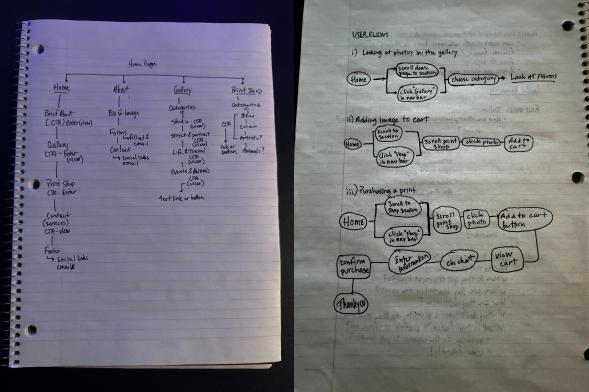
Site Map & User Flow
Site maps and user flows helped structure my website for clear navigation, and a smooth user experience. Cool right? They ensure users can find what they need quickly while aligning the design with business goals.
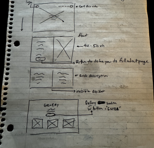
Paper Sketches
My low fi sketches helped quickly explore layout ideas before committing to wireframing. This allowed for quick iterations, clear structure planning, and early problem solving.
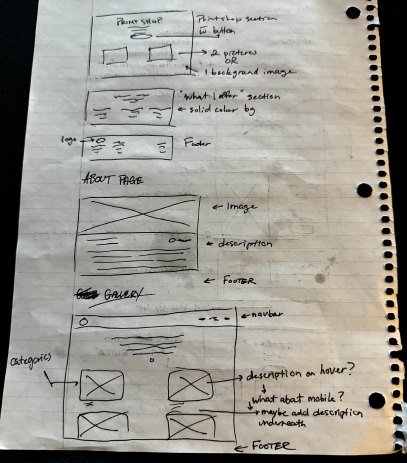
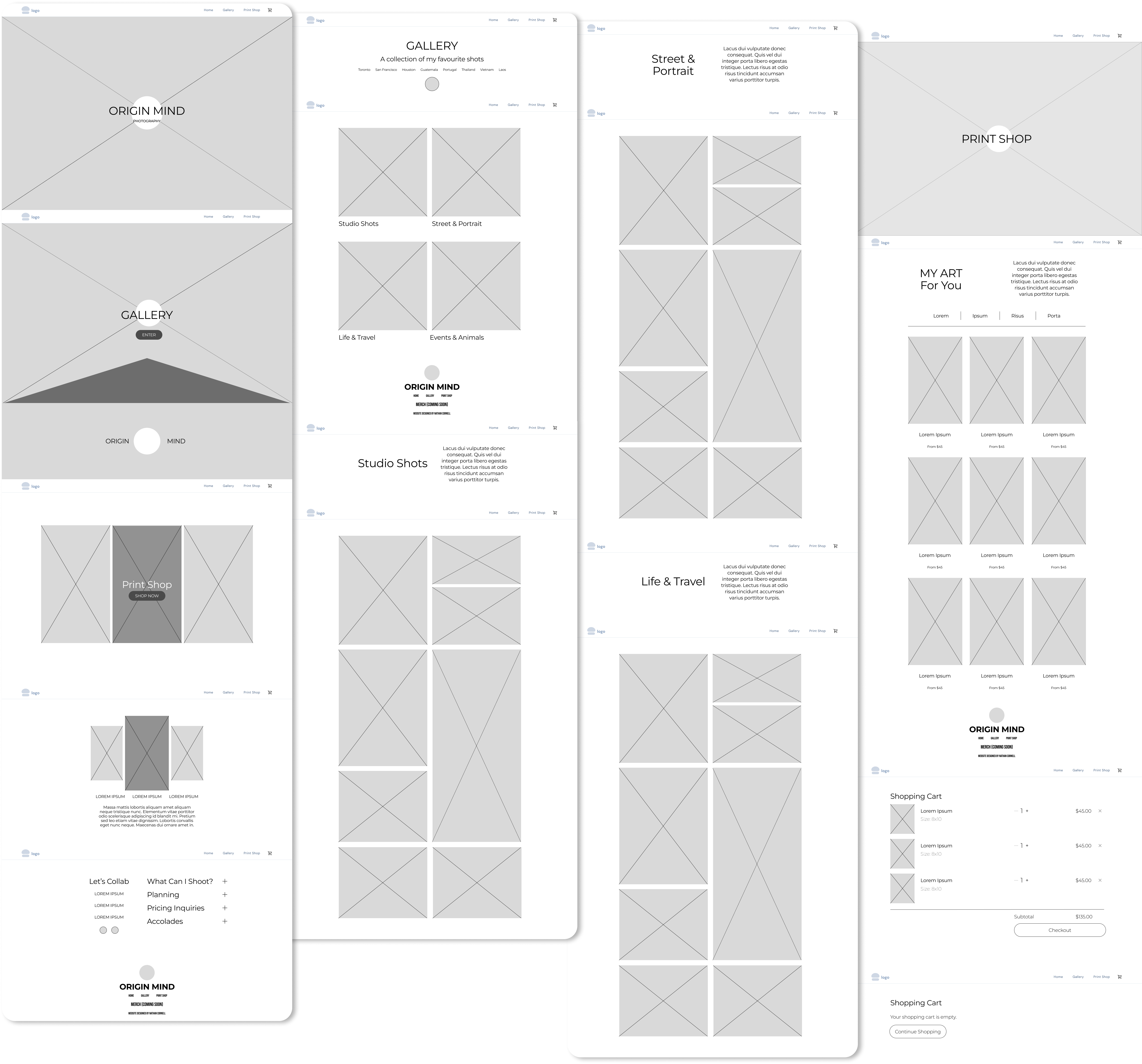
These wireframes set the foundation for layout, structure, and functionality before moving to high fidelity. My focus was on usability, clarity, and user flow. Photos need to be large and easy to see, but too many can create clutter. Categorizing images keeps the design clean and organized. The goal is to make the shop, gallery, and contact information easy to find while keeping the site visually engaging.
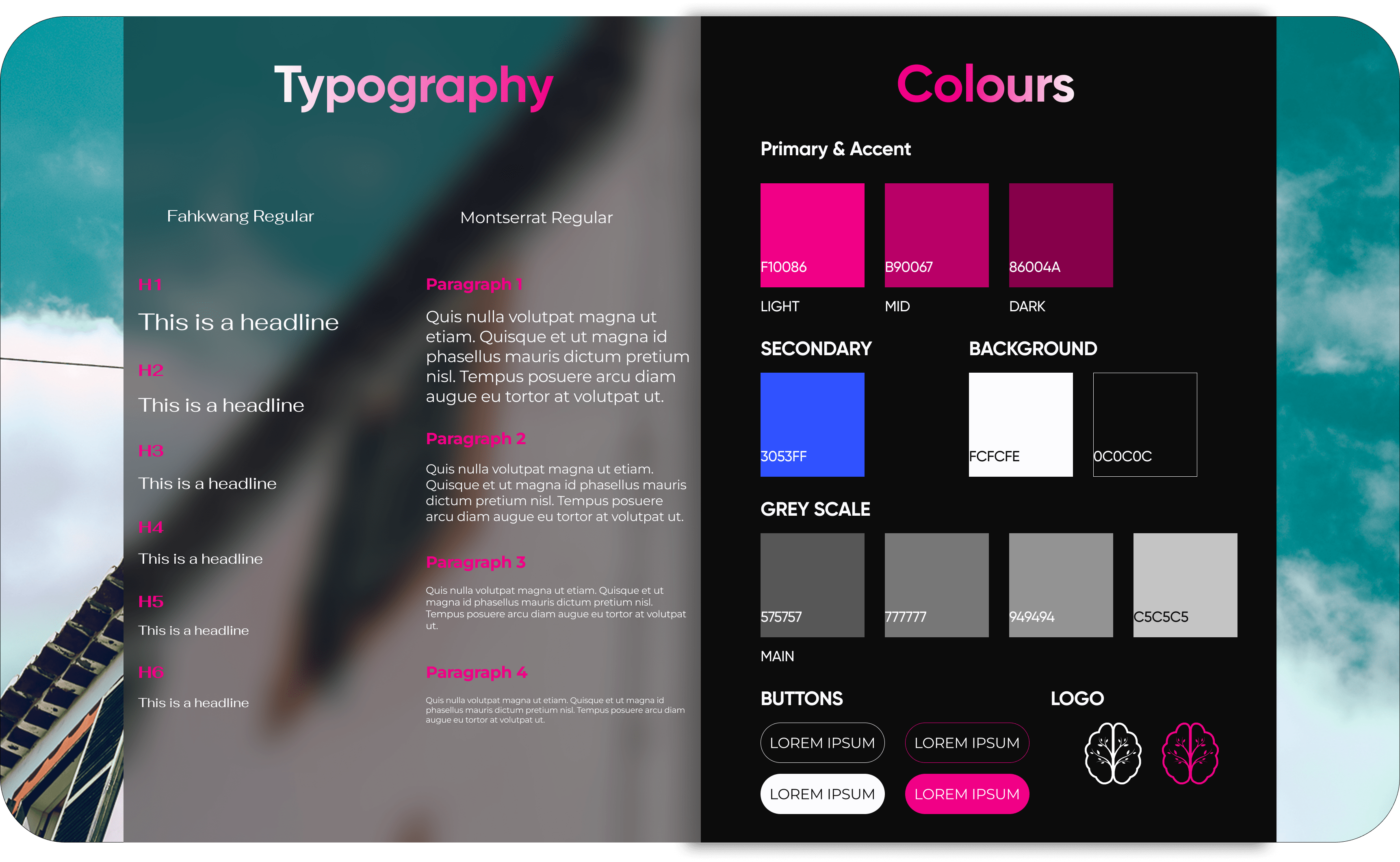
This style guide sets clear standards to ensure brand consistency and readability. Since I often work with low-light photography, I felt that a dark background best represents this.
The fonts I used are Fahkwang & Montserrat.
Fahkwang, a Thai and Latin sans serif, connects to my time in Southeast Asia, mainly Thailand, and stands out with bold, clean lines for headings. Montserrat compliments it with a timeless, urban feel that aligns with a lot of my travel photography.
Both of these offer strong readability and balance.
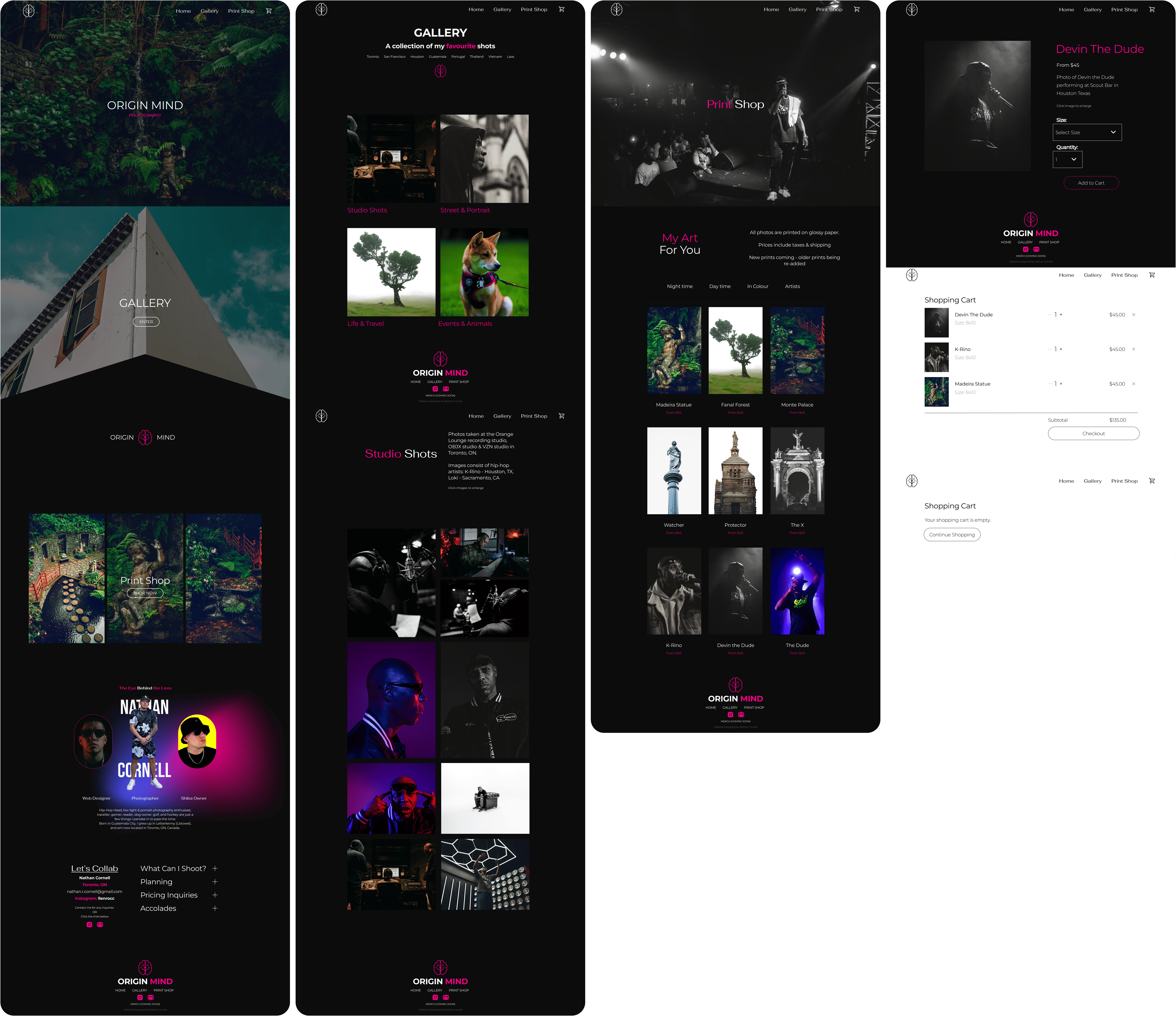
After combining all of the elements shown throughout the process, I have designed what I feel is a very accurate representation of my photos, editing style, and the brand. The dark tones, accent colours, and big images help create a elegant, sleek and modern appearance. This greatly helped my online presence and led to sales on the first day of launch.
Figma
Photoshop
Lightroom
Squarespace
Designing and launching this site was a great experience, but there's always room for improvement.
I added too many photos to the gallery, ignoring my research. I struggled to narrow them down and wanted to showcase adaptability. A more curated selection would stronger.
I also replaced a dedicated About Page with a section on the landing page. In hindsight, this removed a clear CTA and made users scroll to find it.