Founded by Jeff Lange in 2010, Jeff Lange Construction marked the beginning of a new chapter in his professional journey, allowing him to bring his vision to life while setting new standards in the construction industry.
Ensure clear navigation for showcasing projects and services.
Highlight trust-building elements such as testimonials and certifications.
Create a mobile friendly experience for easy access.
Optimize content to provide essential information quickly.
Designing a new website for JLC involves creating a user-friendly layout, showcasing projects effectively and presenting services & contact info clearly.
This will help establish trust and make it easier for users to learn about the company.
Analyze Competitor Websites
- Are there any weaknesses? If so, what are they?
- Identify common usability issues and missing features.
- Website layout & design, how easy is it to access pertinent information?
- Colour palettes, is there a trend among different company sites?
- How do they showcase their past projects & present services?
User Interviews
- Identify clients' top priorities, such as project galleries, services and contact details.
- Understand how users search for construction companies and what influences their decisions
Conversations with potential clients and home buyers revealed their pain points and key factors they consider when choosing a contractor or home builder.
• Overcrowded layouts with too much text or poor visual hierachy
• Lack of clear calls-to-action for contacting or requesting quotes
• Poor mobile responsiveness, making navigation difficult on smaller screens
• Missing or hard to find contact info
• No search functionality for specific services or projects
• Slow load times
• Lack of testimonials or trust building elements
• Cluttered designs - hard to locate key details
• Limited use of intuitive navigation - forcing to dig for information
• Some sites do not highlight services or projects on home page
• Project galleries that lack detailed descriptions
• Services listed in bullet points with minimal explanation
• No high quality images or video
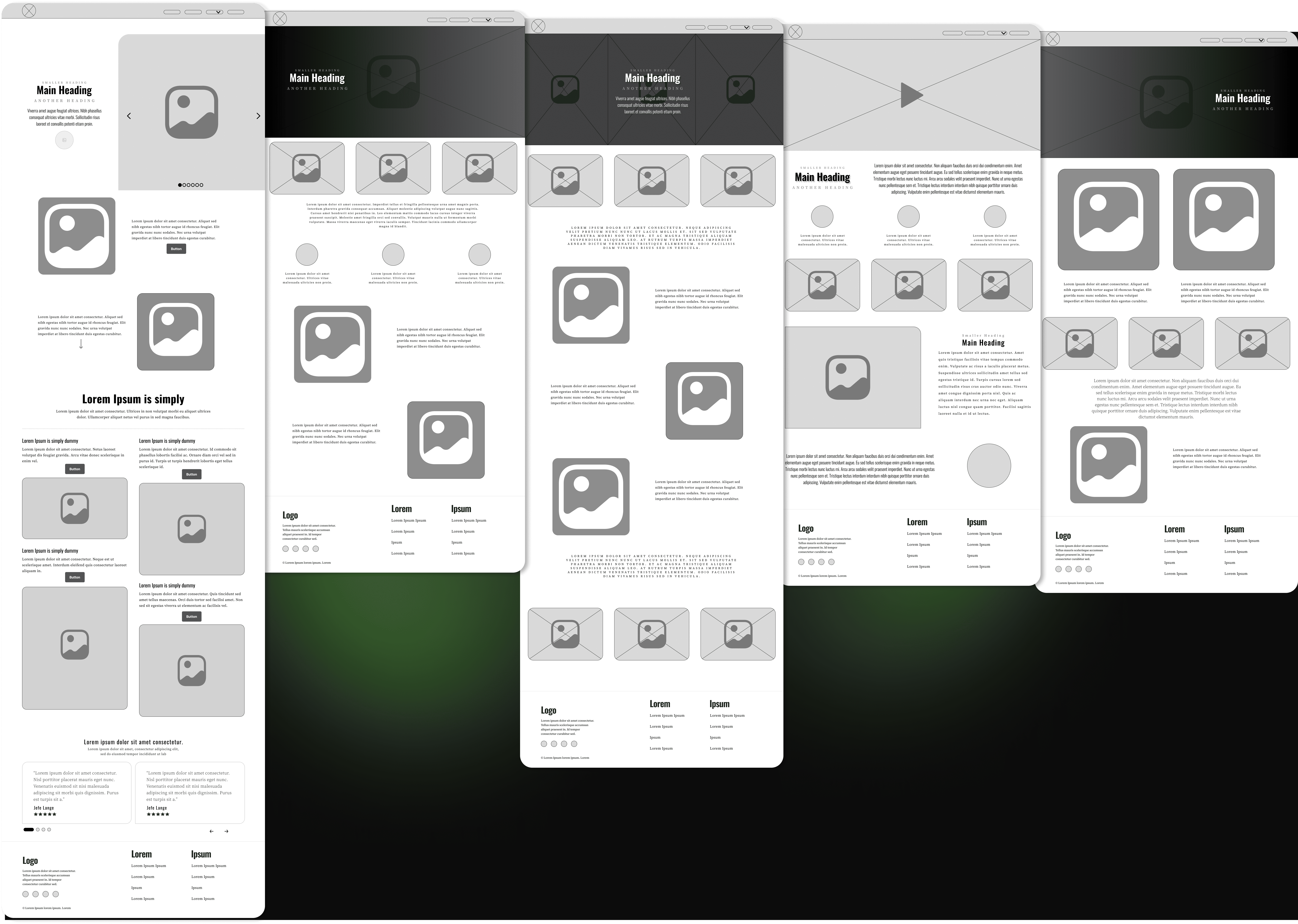
In this step, wireframes were created to test & agree on the websites general direction, clarify the content, and apply a new structure. It needed to have clear pictures of past projects, concise descriptions of services, easy to find contact information and clear a call-to-action, while still maintaining the feeling of your friendly neighbourhood construction company.
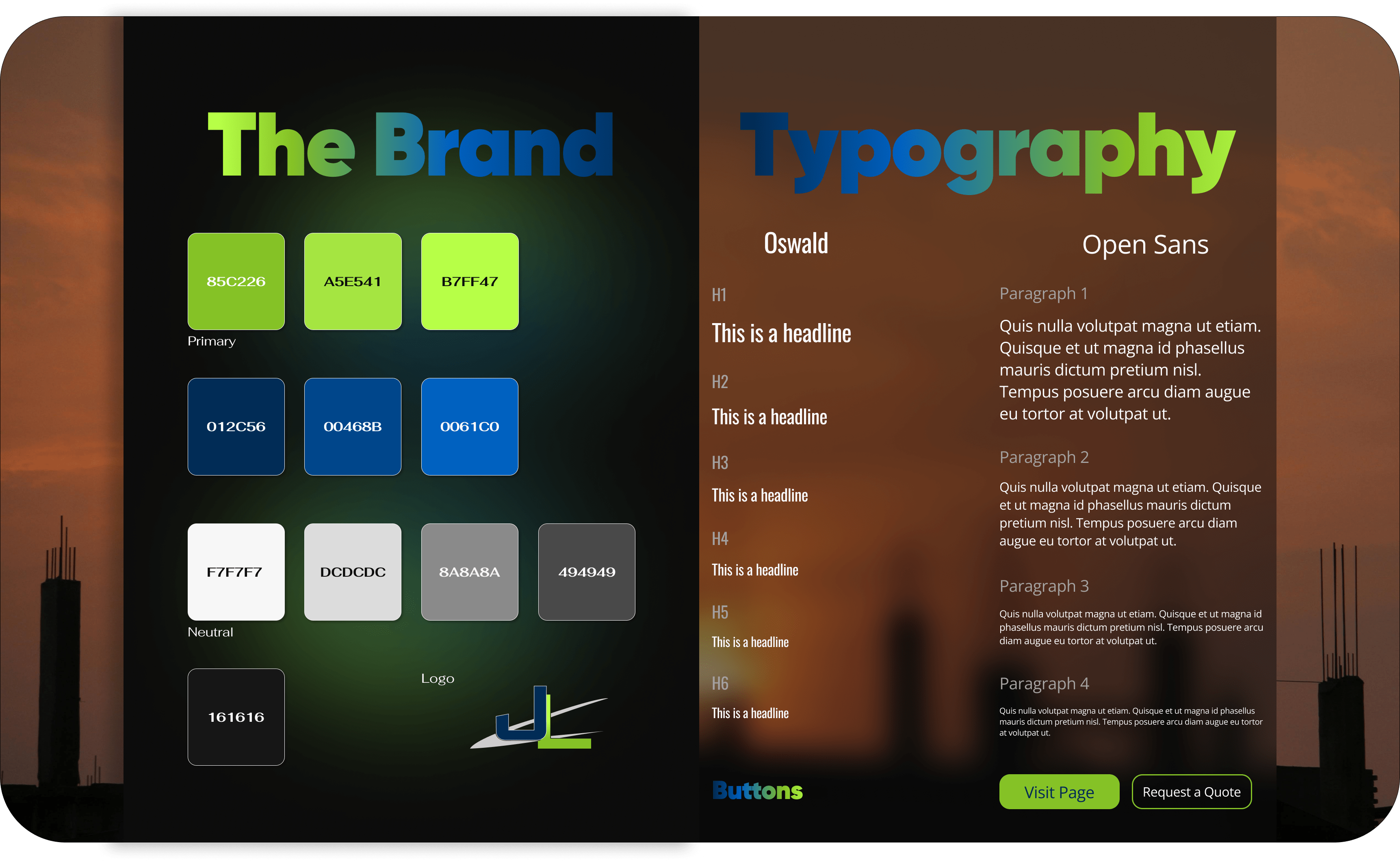
The client already had a logo & colour scheme, so I simplified the current design system, added more colour to the new site, and chose new fonts to freshen up the page. JLC was not sure which fonts they wanted so I put together a few different pairings for them to choose from, and they went with Oswald and Open Sans. Bold, modern, and minimalistic, both of these fonts compliment each other well.
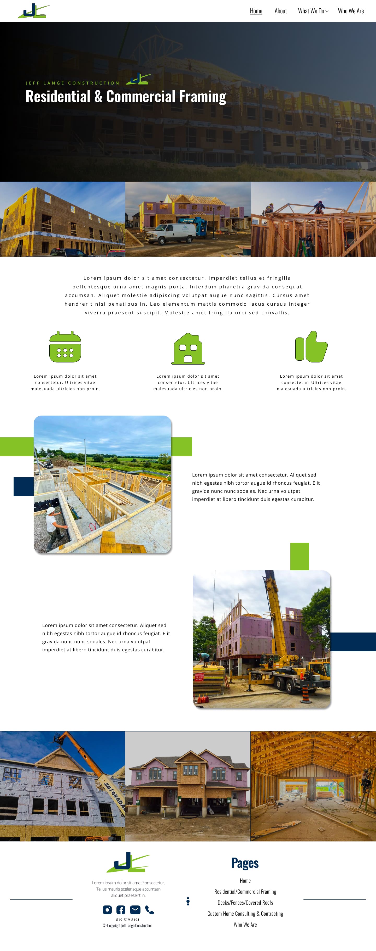
Client was very happy to have an updated company site that really speaks to their background, history, and successful business. I went with the white background to signify honesty, purity, which marked new beginnings, as well as legibility & accessibility.

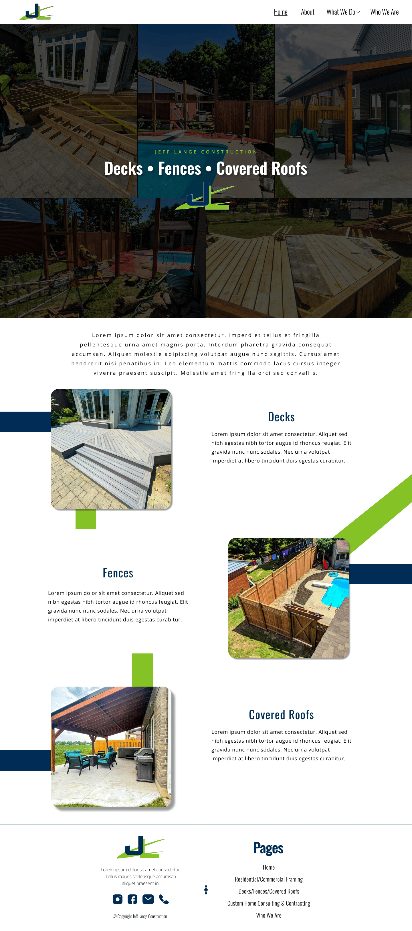
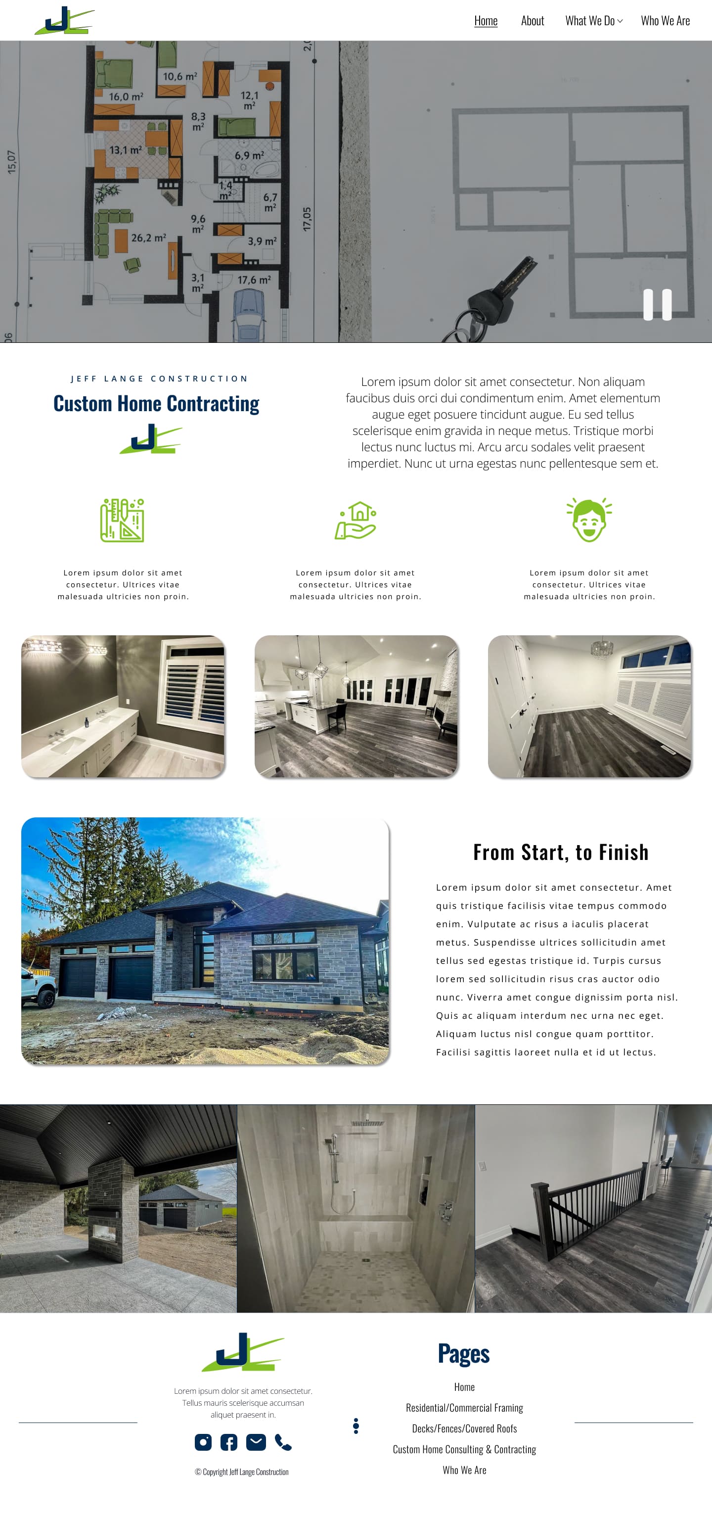
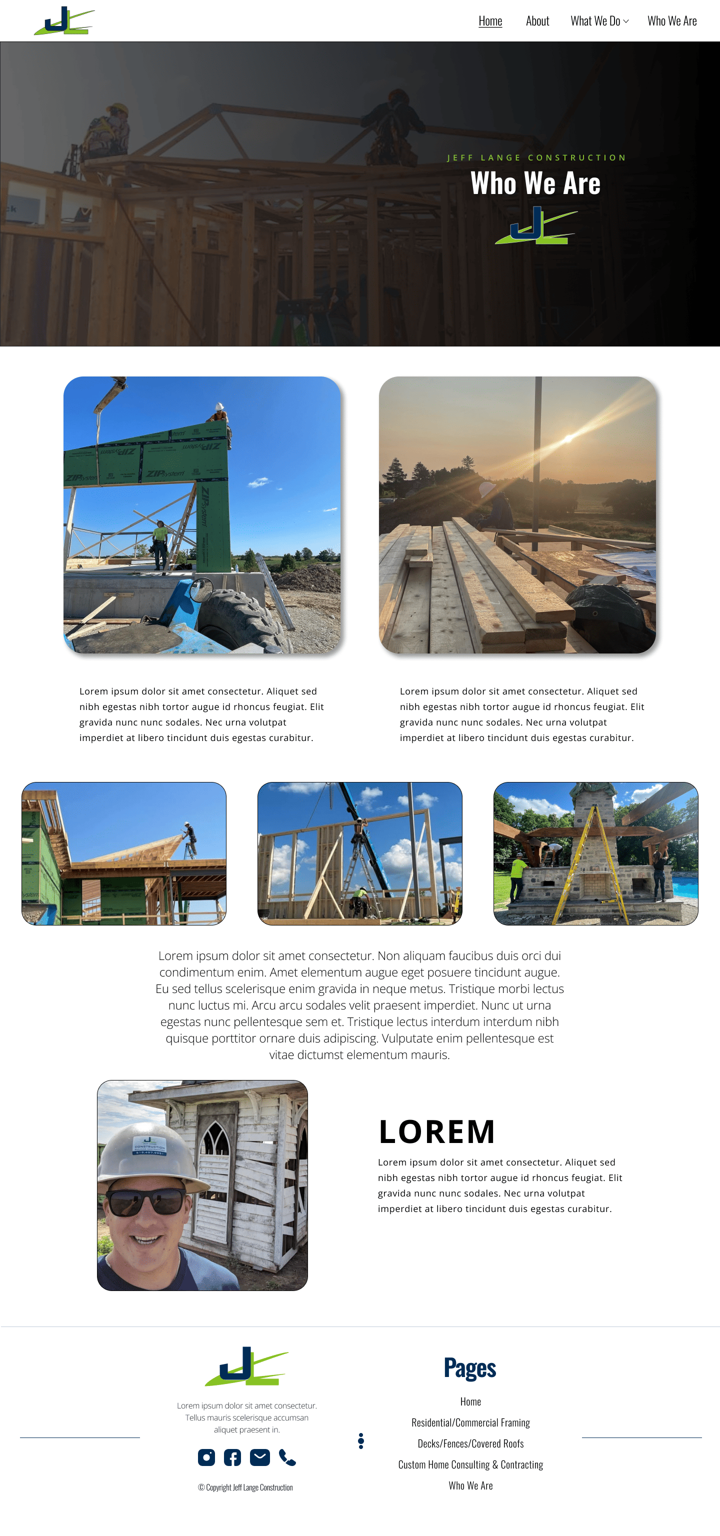
Figma
Webflow
This was a great experience working side by side with JLC to make sure all of their needs were met. But, the work never stops. Looking back on the project, there are minor changes I would make.
a) I would spruce up the navbar & drop down menu. I feel that there is too much white space, and the typography isn't big/bold enough. Maybe add some more colour.
b) The footer. Although the client likes the footer, I feel that it could use a different layout, with some added colour or a darker shade of white so that it doesn't blend in with the rest of the page. The format for the listed pages needs a different look as well, I don't find it attractive enough to the eye.